Hulu
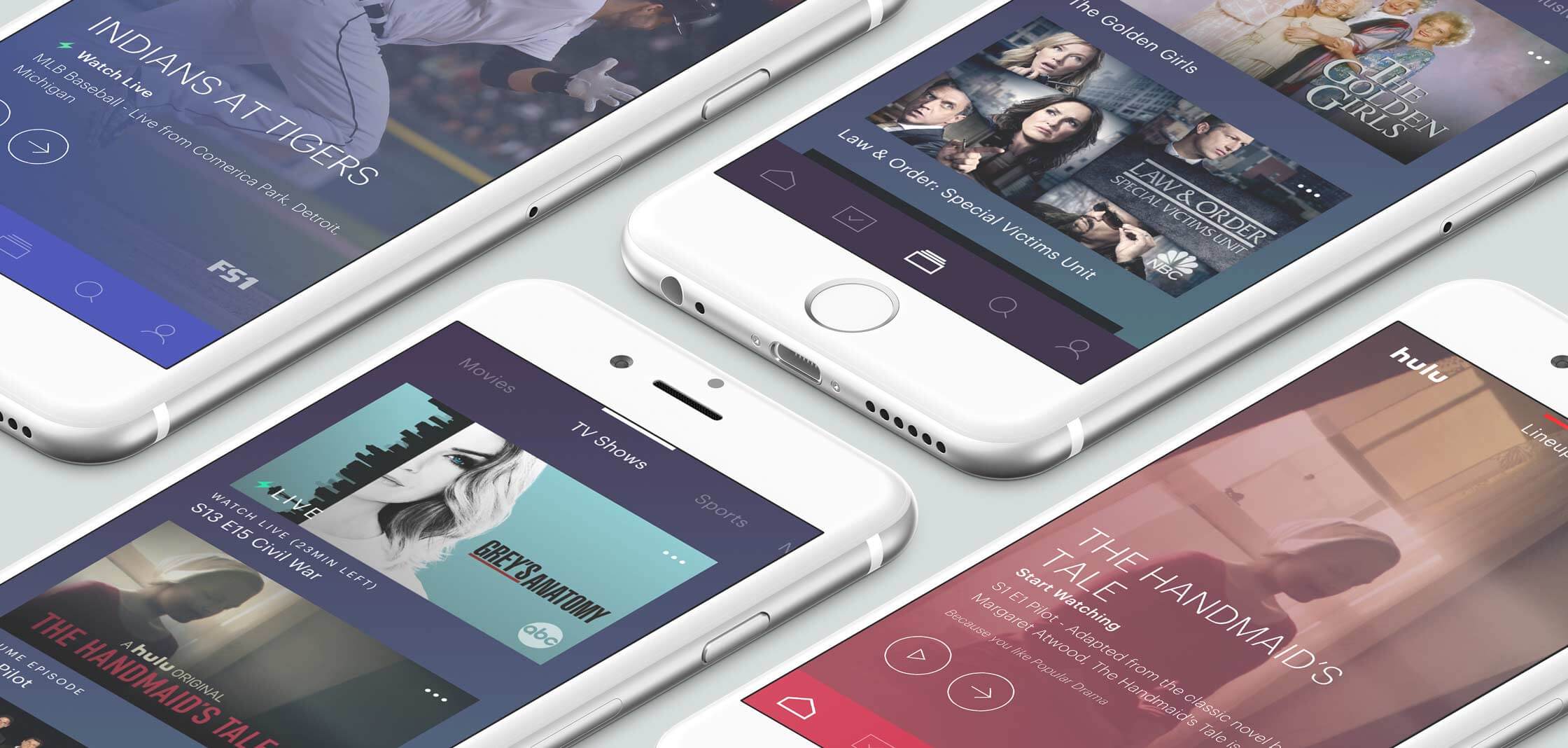
While working at HUGE I was part of an embedded team at Hulu tasked with redesigning their disparate platform experiences to create a unified but flexible new ecosystem.

As a Senior designer it was my job to work with Hulu's designers and product managers to develop an interaction model that worked across TV, tablet and mobile devices.
Hardware UX
Navigation with modified remote
Navigation with video game controllers
Channel flipping paradigm
Software UX
Unified interaction model
Home theater platform design
Cloud storage interface
Now playing experience
A new interaction model
Living room first
With a strong focus on streaming devices we wanted to deliver a strong living room experience. Because of the limited, sometimes cumbersome remote control it was important to start there and then move to the more flexible touch screen of mobile and tablet devices.


Quality over quantity
Our primary strategy was to break the endless sprawl of content grids and to leverage Hulu’s recommendation engine to deliver the content users want in a focused way.


Details matter
With the reduced interactivity of the remote it was important to get the details right. We explored ways


Showpage and channel “Flipping”
I focused heavily on the design and layout of the show pages and player UI. It was important to provide a simple viewing experience while allowing users to “flip” channels in a more efficient way.
We started by creating an intuitive navigation model that would reflect what a user expects from a TV interface while adding in special Hulu features in ways that felt natural.

Once we understood the interaction model we went through many rounds of design to make sure each piece of the experience would look great and feel great.

At the same time we worked hand in hand with the mobile design team to make sure we were creating an experience that translated across devices.